Nearpod has a new look!
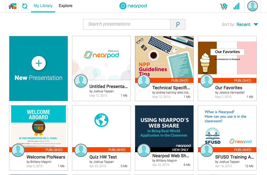
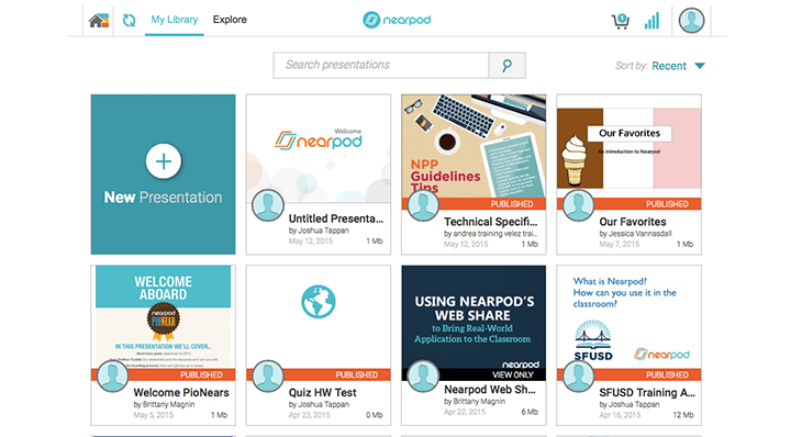
We are very excited to share our new ‘My Library’ design with you! In this release, you will find the same great features in a simpler, cleaner layout that saves you time and allows you to focus on what’s most important – creating the best lessons to engage your students.
In our new design (currently available on the Web App), you can manage all of your Nearpod presentations in one place, My Library.
All of your published and unpublished NPPs appear in the My Library screen. The Create screen is now solely for editing presentations.
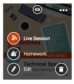
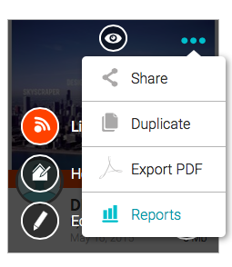
As part of the new design, you can launch a homework or live session from any presentation in one click.
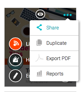
Sharing capabilities are improved as well! You can share any Nearpod presentation directly from each presentation’s thumbnail.
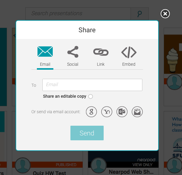
Once in the sharing screen, you can easily share the student view of the presentation (via email, direct link, social media, and embedded code), or click the radio button to “share an editable copy” that will add the presentation to your colleagues’ Nearpod library.
Reports for all of your NPPs are accessible from My Library.
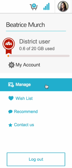
For administrators, the “manage” menu is now accessible from anywhere on the platform by clicking the profile button.
Here’s a short Nearpod that shows how to easily access and enjoy the new ‘My Library’ section.
We’d love to hear what you think about the new design, so send your feedback with a blog comment, on Twitter (@nearpod), or via email to [email protected].
Nearpod’s award-winning platform is used by thousands of schools around the globe, transforming classroom engagement.
